As deadlines approach, you might be thinking about “closing out” some of your yearbook pages and sections. The portrait section often seems like one of the easiest to sign off on and one of the less creative areas of the yearbook—until you get into the weeds of proofing all the fine details and try some new ideas for the layout. While proofing applies to all pages, the portrait section requires a different approach, especially if you use a photography company for your school photos where you don’t have to edit every photo.
Proofing Portraits vs. Proofing Portrait Pages
There’s a distinction between proofing portraits and proofing portrait pages—two separate but connected tasks. In a previous post, I discussed the importance of using Portrait Proof Sheets. These sheets aren’t about layout; they’re for checking details like correct spelling of names, grade assignments, and the proper use of punctuation (hyphens, apostrophes, etc.).
Quick Checklist for Using Your Portrait Proof Sheets:
- Are students assigned to the correct homeroom/teacher/grade?
- Are names spelled correctly?
- Are names formatted properly (e.g., apostrophes, capitalization, hyphens)?
- Will you use full names or nicknames?
- Do all the names fit in the allocated space?
- Should any students be added or removed (new students, transfers)?
- Are there any missing students? Make a list to track down missing photos.
- Is anyone on the “Do Not Photo” list?
- Don’t forget to update your database with any changes using the digital file from the photographer!
Once you’ve handled the data proofing, it’s time to focus on the layout.

Portrait Page Layout
Portrait page layout is crucial. The layout should be finalized before adding names and portraits. This involves deciding the size and shape of photo boxes, as well as the placement and style of names. Setting up the general background and page layout ahead of time helps streamline the process.
Considerations for Layout:
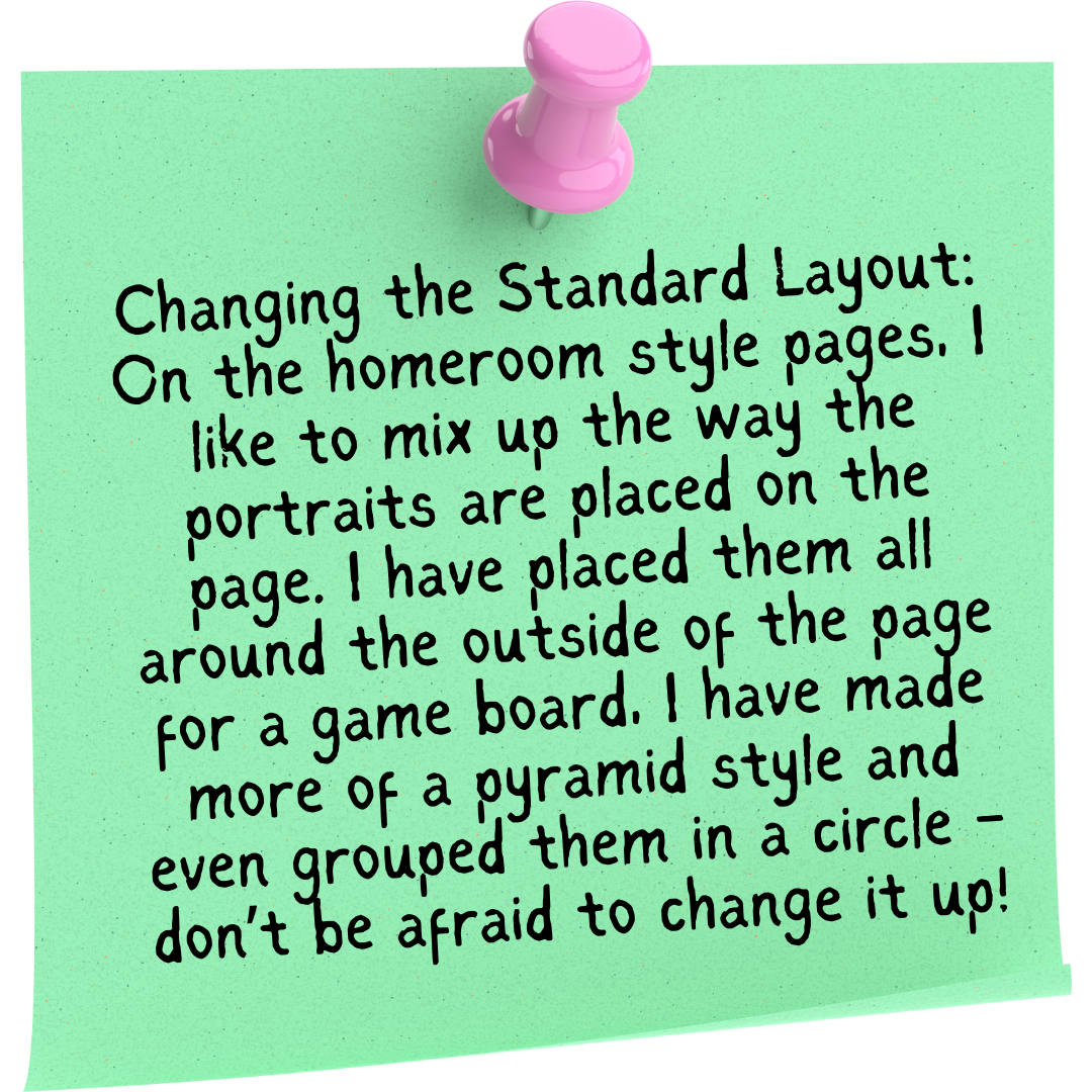
- Photo Box Shape: Portrait boxes can be any shape, but keep ease of viewing in mind. I prefer square photo boxes—they minimize extra space around the portrait and allow you to fit more photos while keeping the focus on the students’ faces. I’ve also used circles and hexagons for variety. Experiment with different shapes, and remember you can always reflow your portraits if you change your mind.
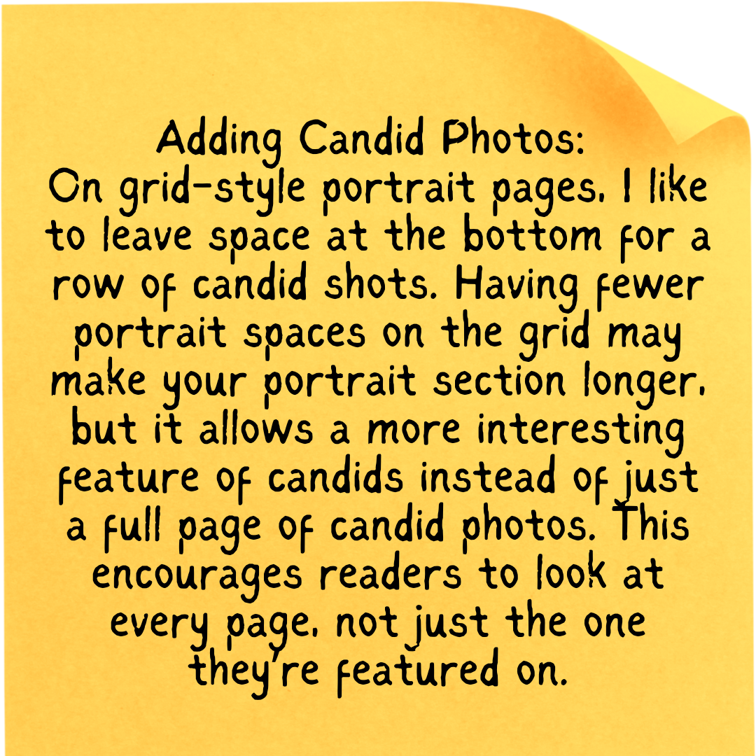
- Grade Level Differences: For younger grades (e.g., PreK-5th), I organize portraits by grade and homeroom, then adjust the layout to match the overall theme. For older grades, I typically use a more standard grid layout, with portraits arranged alphabetically by grade.
- Custom Grid Adjustments: Most yearbook platforms allow you to easily change the number of rows and columns to fit your student count. This gives you flexibility in adjusting portrait sizes and spacing.
- Choosing a Font: Select a font that’s easy to read and matches your theme. Always test it out with various names—what may look great to you could be difficult for others to read or may not suit all names.
Flowing Portraits and Names
Once your layout is ready, it’s time to flow the portraits and names. Photography studios usually provide a digital file with school photos, which you can use to merge the data into your yearbook software. This process is called “flowing” and allows portraits and names to automatically populate into your layout.

Proofing Portrait Pages
After flowing the portraits, it’s time for detailed proofing:
- Backgrounds: Are the backgrounds consistent? Do they match your plan, or do you want to make changes?
- Titles and Page Elements: Are all titles, headings, footers, and page numbers in the correct locations?
- Portrait Boxes: Ensure there are the right number of portrait boxes per page. Adjust if you have too many or too few, then reflow the portraits as needed. Even adding a new student is a simple task.
- Text Boxes: Can you read the names in the chosen font? Is the font size appropriate? Check for long names that may be cut off and adjust accordingly. For long names, consider breaking them into two lines—first name on top, last name below – my preferred style placed under each portrait)
- Portrait Alignment: Check that all portraits are properly positioned in their boxes. If a student’s head or body is cropped awkwardly, adjust the image.
- Final Adjustments: Make sure any last-minute student additions or changes are reflected in the layout.
The Big Review
After completing these detailed checks, it’s time for a final, big-picture review of all portrait pages. Use a Checklist Cheat Sheet for things like margins, font size, placement of headings, background consistency, and photo box styles. This final review should be a quicker process, but the checklist ensures that nothing gets overlooked.
What seems like a simple process often involves a lot more detail than expected. I’ve often found myself halfway through proofing only to change something and need to go back and adjust fonts or layouts all over—but that’s all part of the process! I see it as evolving my style or vision. With careful attention to detail and a solid checklist, you’ll have polished portrait pages that stand out.
