White space is a forgotten yet important design element in yearbook design. It refers to the area around and between the elements on a page, and it can be used to create a visually appealing and easy-to-read publication. It can be used to balance the distribution of elements on a page, create contrast between elements, establish a hierarchy of information, and guide the reader’s eye through the page.
Using White Space Effectively in Yearbook Design
Those who are designing the pages should aim for a balance of white space and content on each page. It can be used to create a path between content by incorporating it into borders, margins, photo placement, and caption placement.
White space, often referred to as “negative space,” is an essential element of yearbook design. It plays an important role in creating a visually appealing and easy-to-read publication.
Importance of White Space
White space is not simply empty space; it is a powerful design tool that can be used to achieve various effects:
- Visual: It helps the visual weight of different elements on a page, preventing any one element from dominating the layout.
- Contrast: It creates contrast between elements, making them stand out and attracting the viewer’s attention.
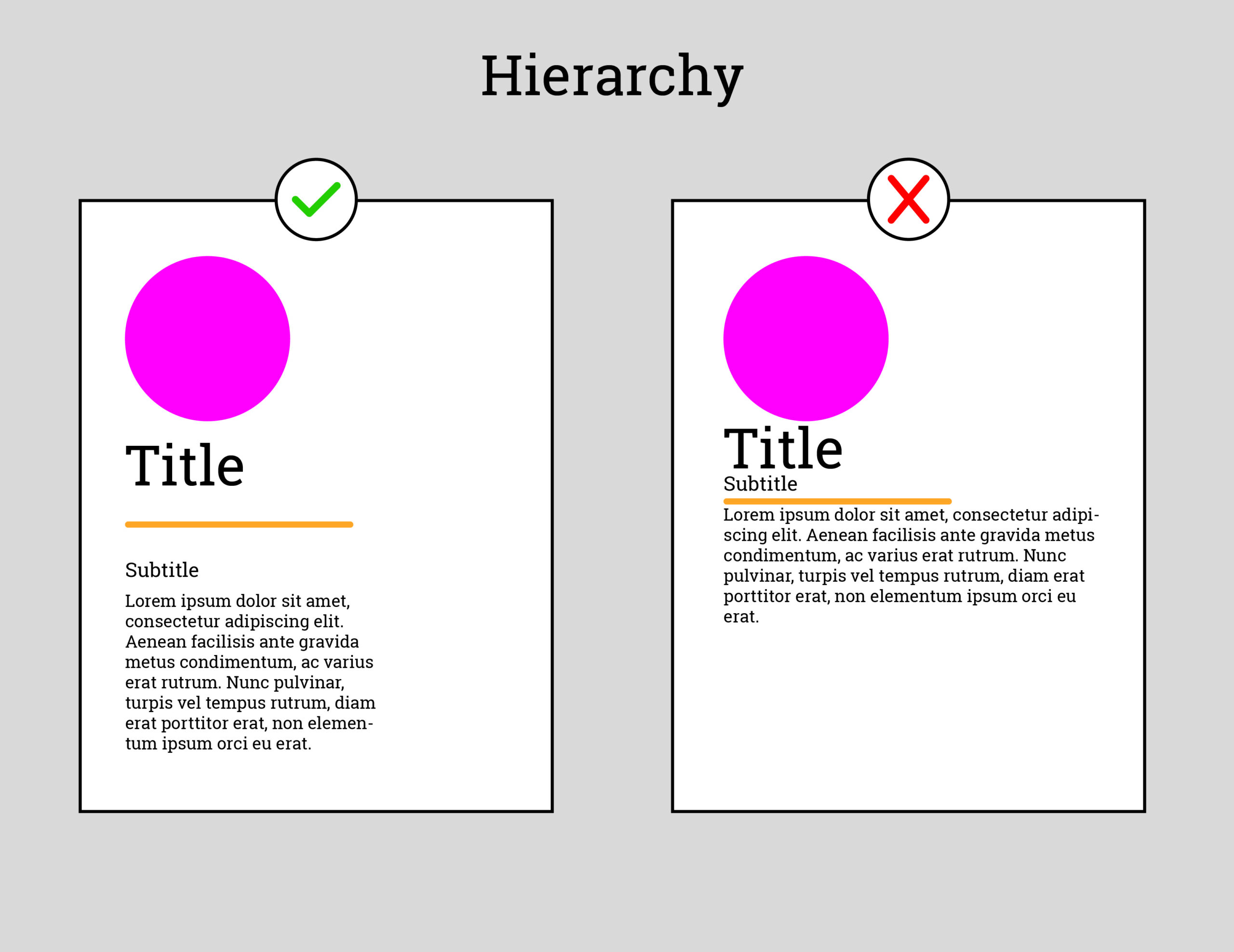
- Hierarchy: It can be used to establish a hierarchy of information, guiding the reader’s eye toward the most important elements.
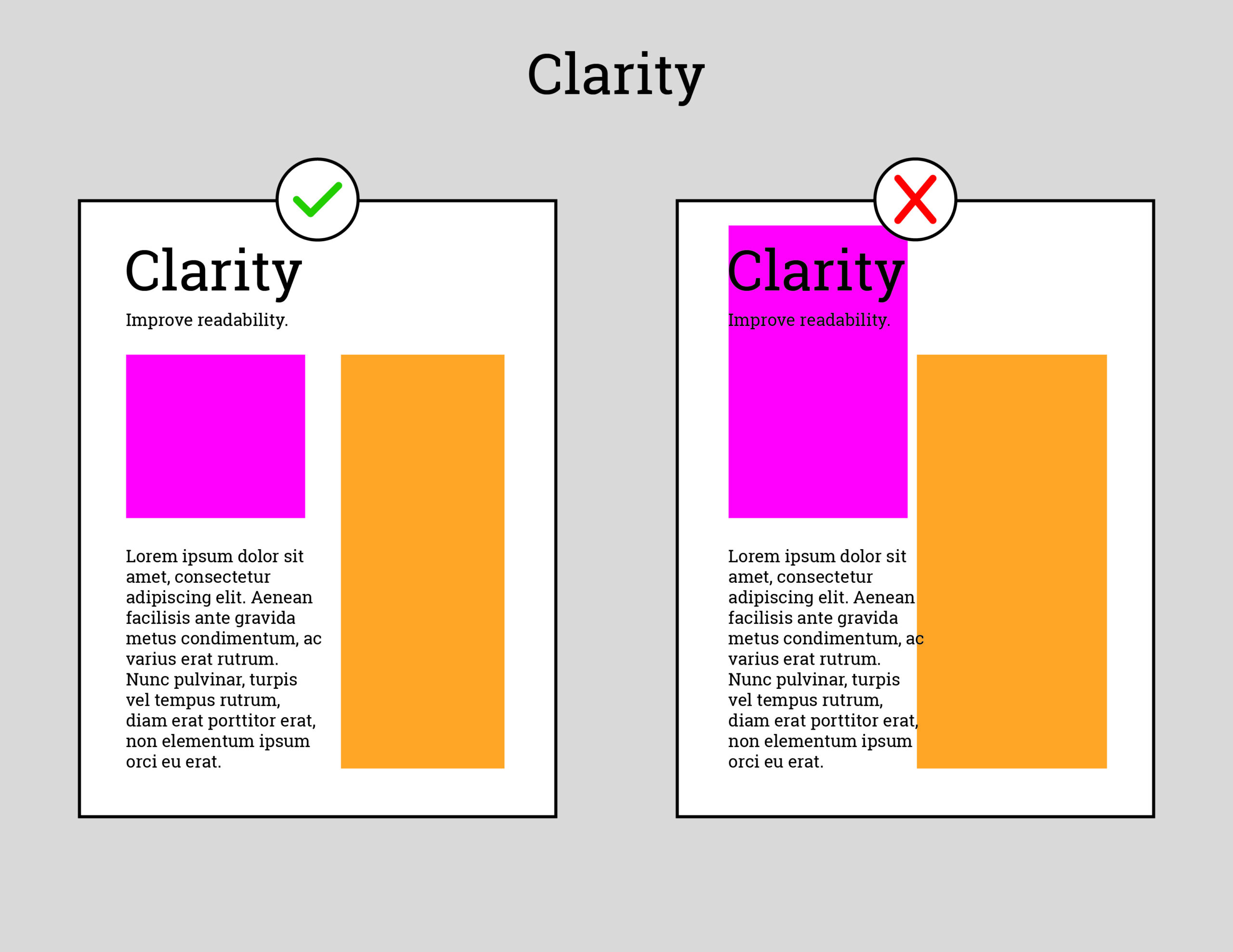
- Clarity: It improves readability by making text easier to scan and digest.

How to use white space in your yearbook:
- Use white space to create balance. Too much or too little white space can make your pages look unbalanced. Aim for a balance of white space and content on each page.
- Use white space to create contrast. White space can help to make your text and images stand out.
- Use it to create a sense of hierarchy by using more white space around the most important elements on your pages.
- Use white space to guide the eye. White space can help to guide the eye of the reader through your pages. Use it to create a natural flow from one element to the next.
Tips for using white space in your yearbook:
- Don’t be afraid of white space. It is not an empty space; it is a valuable design element.
- Use white space to create a sense of calm. Yearbooks can be very busy and cluttered. Use white space to give your readers a break.
- Use white space to create a sense of sophistication. A well-designed yearbook will use white space effectively.
Here are some specific examples of how to use white space in your yearbook:
- Use white space to separate photos from text. This will make your photos easier to see and will help to break up the text on your pages.
- Use white space to create margins around your text. This will make your text easier to read and will give your pages a more polished look.
- Use white space to create borders around your images. This will help to draw attention to your images and will make them stand out on your pages.

Advisor Tips
- Encourage yearbook staff members to explore the use of white space in various design templates and layouts.
- Provide visual examples of effective white space usage in yearbooks and other publications.
- Incorporate discussions on white space into yearbook design workshops and training sessions.
- Emphasize the importance of white space in creating a professional and visually appealing yearbook.
Remember, white space is your friend! By using white space effectively, you can create a yearbook that is both visually appealing and easy to read.

I love using white space! It’s hard to resist the temptation to pack it all in, but like you say above, white space brings a sense of calm and peace. With so much visual stimulation from backgrounds, graphics, text, photos, portraits, it’s a great way to focus on the important elements and give your eyes and brain a little break! Thanks for explaining this so clearly and with examples it makes it so easy to see the difference.