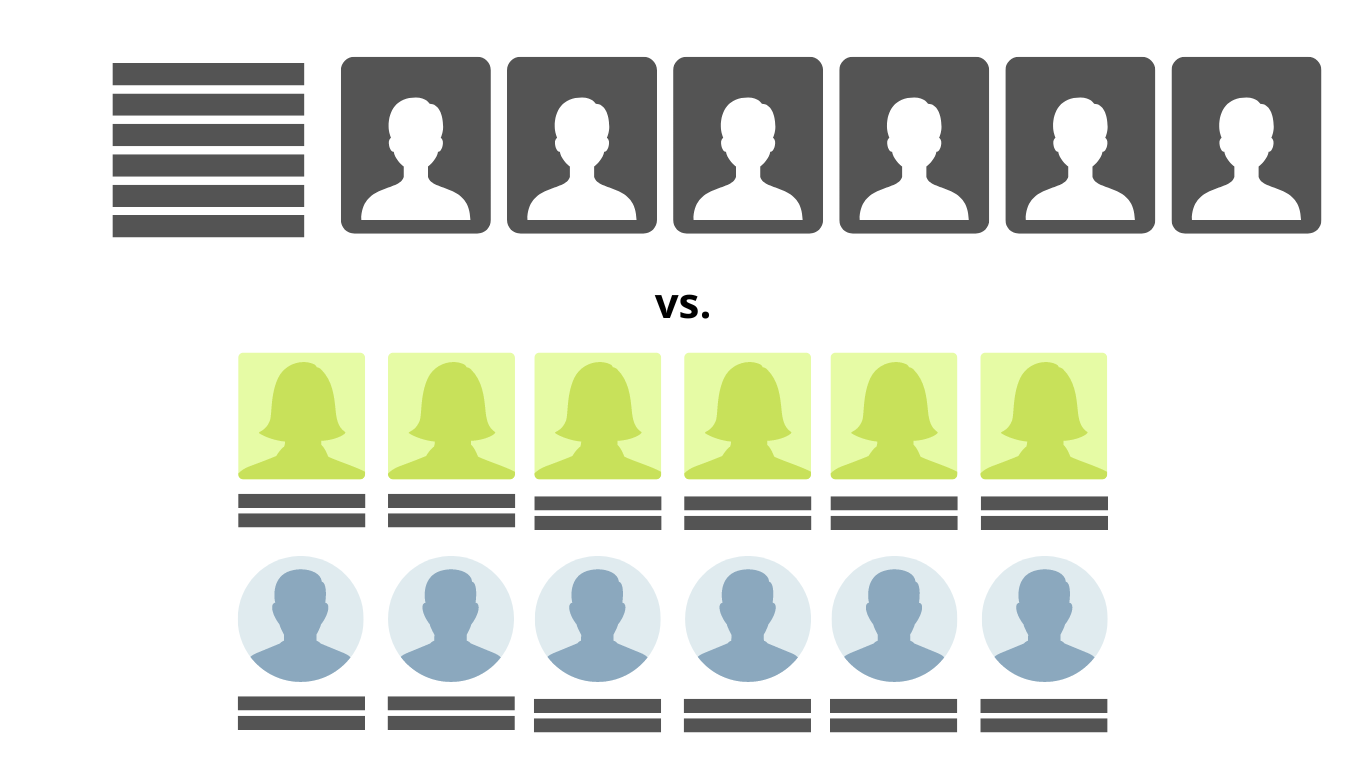
Did you know that you don’t have to use the traditional rectangular frame for your portraits?
I prefer squares! Why, you ask?
A few reasons:
- I can save space, leaving extra room for names underneath the photo or more photos on the page or just a bit more white space.
- I think it gives more focus to the student’s face. What I cut off when I convert a rectangle to a square is usually just part of their shirt.
I’ve even done circles, and again, I felt like it put more focus on the student’s face in the photo.
Another idea: did you know you don’t have to put the names down the side?
I prefer to put the names under the students’ photos. Why, you ask? I like the idea of each student being with their name, and there is no need to count the names and photos to find the match!
I also like to put the names on two lines, so I have more space for longer names

I recommend experimenting and trying something different. Whether it goes along with your theme or just saves you some room or even is a personal preference, it’s worth taking a look at different options!
Looking for more tips on portrait pages? Yearbook Groupie has you covered; check out our other blog, What Is a Portrait Proof Sheet and How to Use It.

