Similar to our post about Guidelines (the outer parts of your pages), using columns and grids in the yearbook layout has many benefits, both for creating a good design and for higher scores for contests. Whether you are starting, designing, or completing your pages, you can still update with columns and grids.
What are columns and grids?
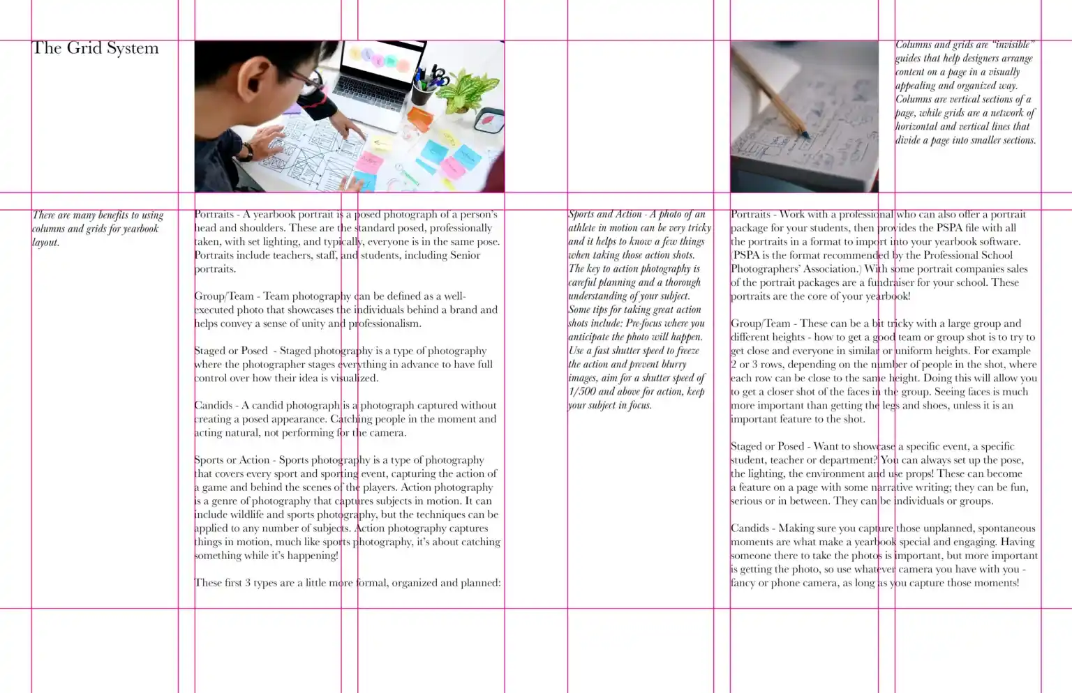
Columns and grids are “invisible” guides that help designers arrange content on a page in a visually appealing and organized way. Columns are vertical sections of a page, while grids are a network of horizontal and vertical lines that divide a page into smaller sections. In most software, you can turn them on or off during the creation or final stages of each page or spread (two side-by-side pages).
Why use columns and grids for the yearbook layout?
There are many benefits to using columns and grids for yearbook layout, including:
- Improved readability: Columns and grids can help to make yearbook content easier to read by breaking it up into smaller, more manageable chunks. This is especially important for long blocks of text, which can be overwhelming and difficult to read without some sort of visual organization.

Example grid layout
- Visual appeal: Columns and grids can also help to create a more visually appealing yearbook layout. By using columns and grids to align text and images, designers can create a sense of balance and harmony on the page. Columns and grids can also be used to create different effects, such as drawing the reader’s attention to a particular element on the page or creating a sense of movement and dynamism.
- Consistency: When used throughout a yearbook, columns, and grids can help to create a sense of consistency. This is because they supply a framework that designers can use to arrange content in a similar way on each page. This helps make the yearbook look more polished and professional.
- Flexibility: Columns and grids are very flexible and can be used to create various layouts, from simple to complex. This makes them a great choice for yearbook layout, as they can be adapted to accommodate a wide range of content, including text, images, and graphics.
Benefits of using columns and grids for yearbook contests: in addition to the general benefits listed above, using columns and grids can also give your yearbook a competitive advantage in yearbook contests. Judges are often looking for yearbooks that are well-designed and easy to read. By using columns and grids, you can create a yearbook that is both visually appealing and easy to navigate.
How to use columns and grids for yearbook layout
When using columns and grids for yearbook layout, there are a few things to keep in mind:
- Choose the correct number of columns: The number of columns you choose will depend on the type of content you are trying to arrange. For example, if you are arranging a long block of text, you may want to use two or three columns. If you are arranging a mix of text and images, you may want to use four or more columns.
- Use grids to align elements on the page: Grids can be used to align text, images, and other elements on the page. This helps create a sense of balance and keeps spacing even between pictures and text.
- Use white space: White space is the empty space around the elements on your page. It is important to use white space effectively to avoid making your layout look cluttered. Keep it towards the outer part of your pages with photos towards the center (the gutter).
- Use columns and grids consistently: Use columns and grids throughout your yearbook to create a sense of consistency. Even with different sections, you can keep the same columns and grids while using different colors, shapes, and designs.
Create award-winning yearbook layouts
These are suggestions whether you are entering a contest or not.
- Use columns and grids to create a variety of different layouts. Feel free to experiment with different column and grid configurations to create layouts that are both visually appealing and functional.
- Use columns and grids to highlight important information. Use columns and grids to draw the reader’s attention to important information, such as headlines, captions, and photo credits.
- Use columns and grids to create a sense of movement and dynamism. Use columns and grids to create layouts with a sense of movement and dynamism. This can be done by using different column widths, overlapping elements, and using white space in creative ways.
Recap: Encouraged but Not Required
Using columns and grids is a great way to create yearbook layouts that are both visually appealing and easy to read. By following the tips above, you can use columns and grids to create yearbooks that are sure to impress judges and win contests.
It is also important to know that designing your yearbook is to be as creative as you want. Not everyone wants to enter contests, and that is okay. By the time you’re ready to print the book, you and or your team need to feel great about the design, layout, and documentation of your organization or event. If you have questions or feel this article was helpful, please comment below or join the Forums.

Pingback: 10 key areas for teaching yearbook - Yearbook Groupie - Yearbook resources and guides